Dashboard
The Edge Services Platform provides you with an Edge Analytics dashboard that gives you instant visibility on key metrics across the entire streaming delivery chain. The added observability allows you to easily understand the state of the underlying infrastructure performance, audience, statistics, among others.The dashboard offers the ability to analyze specific events and/or filter metrics by a number of specific attributes.
All this data can help you plan and optimize the content for your specific needs.
Note
You can also use a Self-hosted Grafana integrated with Edge Analytics.
Analytics tiers
The dashboard offers a different set of charts based on the Analytics tier associated with your account.
The base configuration is the Lite tier, which is available when you create your account and can be upgraded to the Advanced tier. All the features of the Lite tier are also available on the Advanced tier.
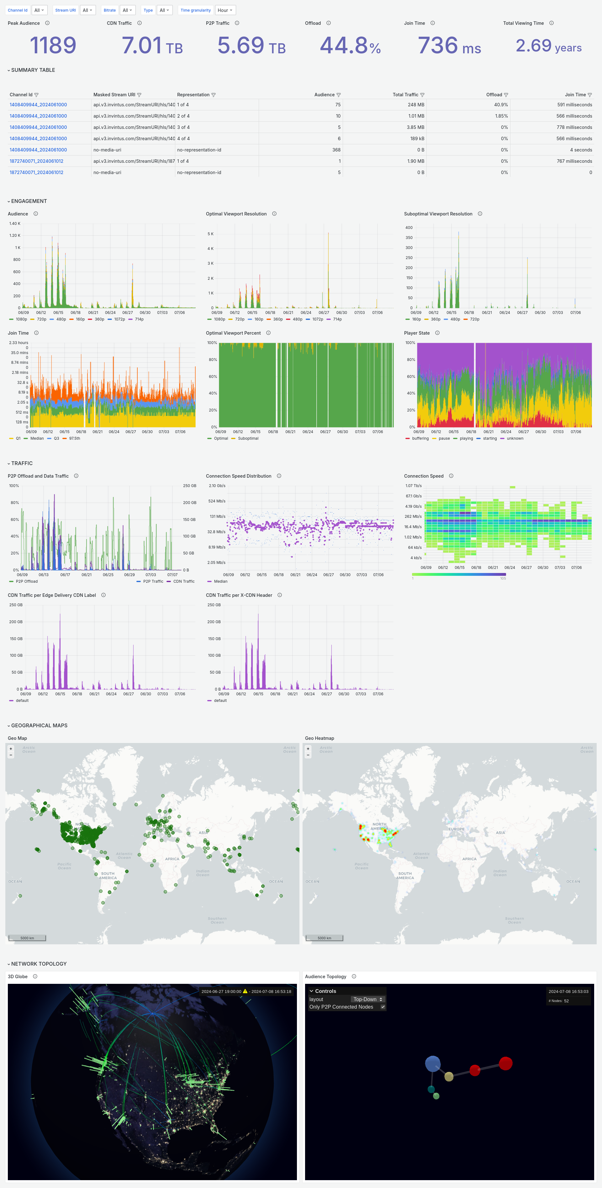
Dashboard on the Lite tier
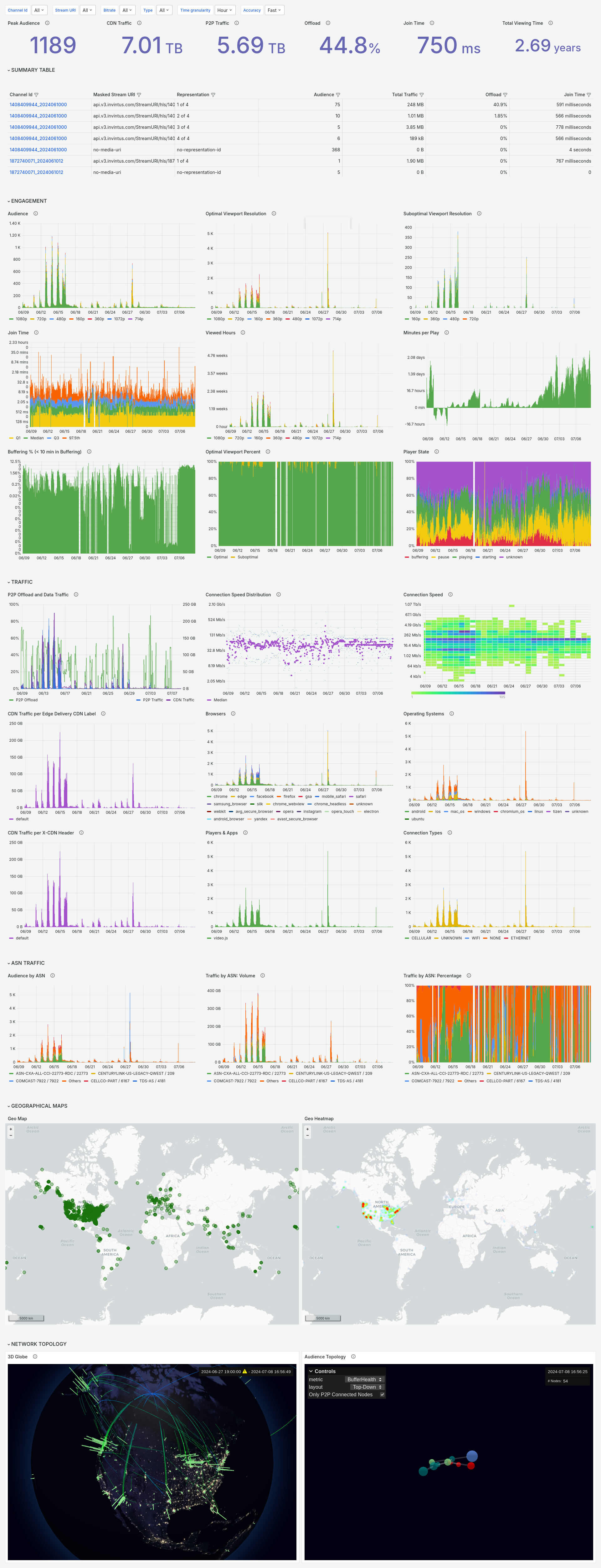
Dashboard on the Advanced tier
Note
Please refer to sales@system73.com for any inquiry on contracting the Advanced tier.
Charts
The charts are grouped into the following sections for convenience:
- KPIs
- Summary Table
- Engagement
- Traffic
- ASN Traffic (Advanced tier only)
- Geographical Maps
- Network Topology
Peak audience (KPI) 
Source: SQL endpoint
/analytics/v1/query/sql
The highest number of devices connected simultaneously for the selected time period.
CDN data (KPI) 
Source: SQL endpoint
/analytics/v1/query/sql
The total data transferred over CDN for the selected time period.
P2P data (KPI) 
Source: SQL endpoint
/analytics/v1/query/sql
The total data transferred over P2P for the selected time period.
P2P Offload (KPI) 
Source: SQL endpoint
/analytics/v1/query/sql
The total P2P offload percentage of the video distribution for the selected time period.
Join time (KPI) 
Source: SQL endpoint
/analytics/v1/query/sql
The median of the amount of time that takes from loading the connection to the first video frame.
Total viewing time (KPI) 
Source: SQL endpoint
/analytics/v1/query/sql
The total of playtime for the selected time period.
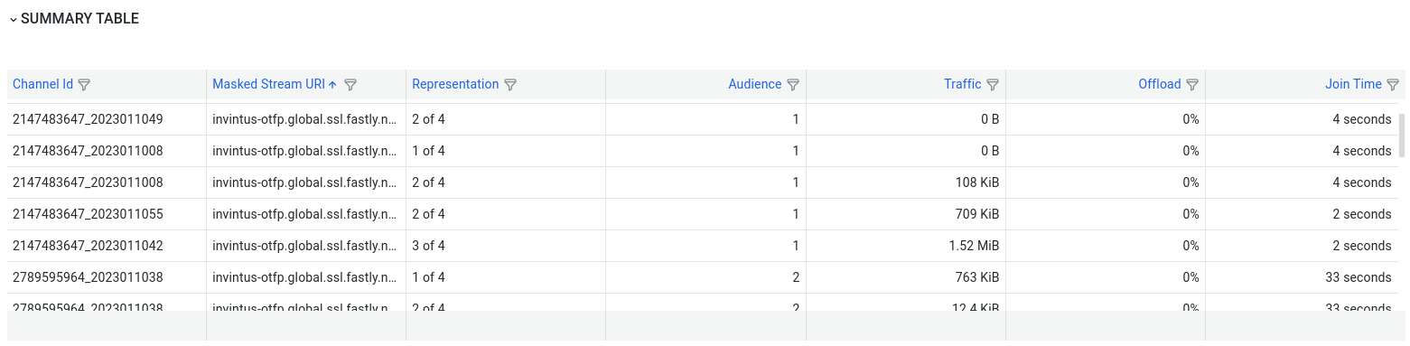
Summary table 
Source: SQL endpoint
/analytics/v1/query/sql
Provides a fine grain view of the mentioned KPIs as well as filter capabilities.
Audience 
Source: SQL endpoint
/analytics/v1/query/sql
Number of playback sessions within the selected time range, aggregated per time granularity interval.
Optimal viewport resolution 
Source: SQL endpoint
/analytics/v1/query/sql
The total number of devices obtaining the best resolution they can represent.
Suboptimal viewport resolution 
Source: SQL endpoint
/analytics/v1/query/sql
The total number of devices obtaining lower resolution than they can represent.
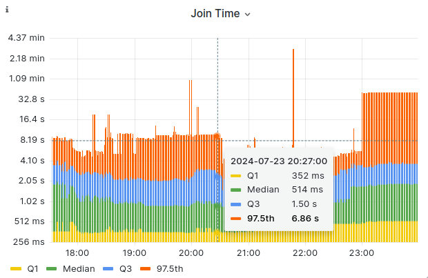
Join time 
Source: SQL endpoint
/analytics/v1/query/sql
A perceived time from the point of the viewer, how much time it takes to present the first frame
after the play event.
Bars are distributed by four quantiles:
- Q1 (25th percentile): This is the value below which 25% of the data falls.
- Median (50th percentile): This is the middle value of the dataset, where 50% of the data falls below and 50% above.
- Q3 (75th percentile): This is the value below which 75% of the data falls.
- 97.5th percentile: This indicates the value below which 97.5% of the data falls.
Optimal viewport percent 
Source: Metrics endpoint
/analytics/v1/metrics/qoe/optimal_viewport/percentage
Percentage of total playing viewers at an optimal/suboptimal viewport resolution, where the "optimal" corresponds to the audience consuming the video representation with a resolution closest to the viewport reported by the video player.
Player state 
Source: SQL endpoint
/analytics/v1/query/sql
Percentage of the reported player sessions within the selected time range, aggregated by player state.
- starting: the starting state measures the initial buffering and its related player internal states.
- buffering: the buffering state measures buffering events that impact user experience, preventing video playback.
- playing: the accumulated time in the life cycle of the SDK when the player state is playing. This is the total time watching video within the viewing session.
- pause: the accumulated time in the life cycle of the SDK when the player state is paused. This is the total time with video paused within the viewing session.
- unknown: the player is in an unknown state, such as when the player has not attached a stream, has produced an error, has ended the stream, the integrator did not pass a value, or passed an incorrect value, or similar. This state is used when the other states are not applicable.
Viewed hours 
Source: SQL endpoint
/analytics/v1/query/sql
The total number of hours the content is being played over time, per granularity time window.
Minutes per play 
Source: SQL endpoint
/analytics/v1/query/sql
The average playtime that the content has been consumed by the audience per session over time.
Buffering % (< 10 min in Buffering) 
Source: SQL endpoint
/analytics/v1/query/sql
Percentage of BufferingTime during PlayingTime for Devices that have been less than 10 min in a buffering state.
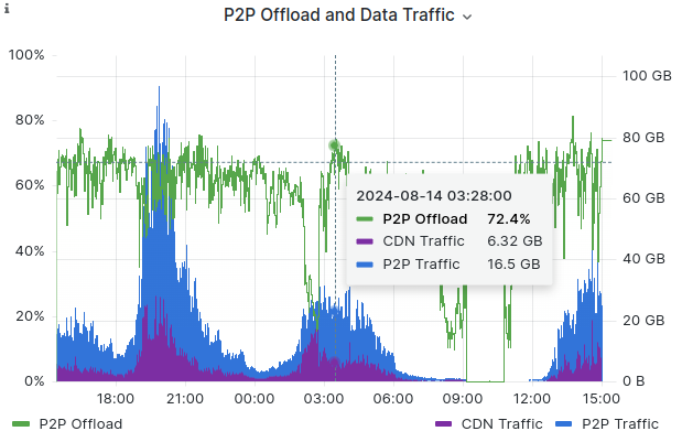
P2P Offload and Data Traffic 
Source: SQL endpoint
/analytics/v1/query/sql
Peer to Peer offload and all the data transferred over CDN (Content Delivery Network/s) and P2P (Peer to Peer).
Connection speed distribution 
Source: SQL endpoint
/analytics/v1/query/sql
Connection speed distribution within the selected time range.
Connection speed 
Source: SQL endpoint
/analytics/v1/query/sql
Total audience distribution by connection speed.
CDN Traffic per Edge Delivery CDN Label 
Source: SQL endpoint
/analytics/v1/query/sql
All the data transferred over the Content Delivery Network pathway(s) configured on System73 Edge Delivery service.
CDN Traffic per X-CDN Header 
Source: SQL endpoint
/analytics/v1/query/sql
HTTP request from the CDN should be included in the header in order to be available on the chart.
Browsers 
Source: SQL endpoint
/analytics/v1/query/sql
Total audience distribution by Browser for web platforms.
Operating Systems 
Source: SQL endpoint
/analytics/v1/query/sql
Total audience distribution by Operating Systems.
Players & Apps 
Source: SQL endpoint
/analytics/v1/query/sql
Total audience distribution by native apps or web media players.
Connection types 
Source: SQL endpoint
/analytics/v1/query/sql
Total audience distribution by their connection type.
Audience by ASN 
Source: Metrics endpoint
/analytics/v1/metrics/audience/asn
Total audience distribution by their ASN (showing separately 'Top 5' + Others).
Traffic by ASN: Volume 
Source: Metrics endpoint
/analytics/v1/metrics/traffic/asn
Total amount of CDN traffic incoming from each ASN (showing separately 'Top 5' + Others).
Traffic by ASN: Percentage 
Source: Metrics endpoint
/analytics/v1/metrics/traffic/asn/percentage
Total traffic volume in percentages from each ASN (showing separately 'Top 5' + Others).
Geo map 
Source: SQL endpoint
/analytics/v1/query/sql
Provides latitude and longitude points distribution of the audience.
Note
Users in the the Advanced tier benefit from extra information in the tooltip: ASN information.
Geo heatmap 
Source: SQL endpoint
/analytics/v1/query/sql
Provides a heatmap of the audience distribution over the world map.
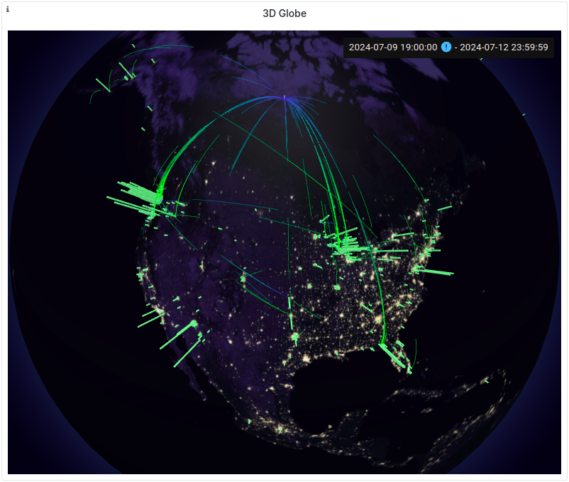
3D Globe 
Source: SQL endpoint
/analytics/v1/query/sql
Provides a geospatial distribution of the audience through a 3D Globe graph. The user can interact with it by rotating the globe and update the information shown by changing the timeframe and other dashboard filter options.
3D Globe Chart Overview
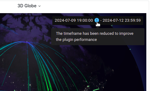
Note
Please note that data points from the past are limited in order not to overload the chart. You can adjust the visible timeframe by changing the "To" date in dashboard filters.
Timeframe info notification
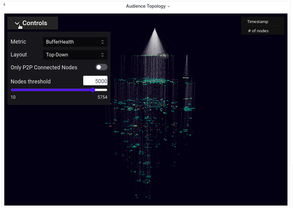
Audience Topology 
Source: SQL endpoint
/analytics/v1/query/sql
Provides the network topology of the audience, showcasing their origin and position from the CDN and allowing the user to explore individual node information based on their Analytics tier account. Please note that the available data retention is up to last 30 days.
Controls and information
The chart also offers aggregated statistics and interactive controls that allows you to tailor the browsing experience:
3D Topology Chart Overview
-
Metric status: From the controls panel, it allows selecting a metric (Bufferhealth, AFBR, or NatType) and coloring the nodes to identify their status over the selection.
Important
This control is only available on the Advanced tier.
-
Layout: It applies a layout to the graph customizing the nodes directionality. You can choose from Top-Down (it gives a tree form to the chart) or Globular (it does not give any direction to the chart and it is spread horizontally).
-
Show only P2P nodes: This option allows you to unload/load the chart by hidden or showing nodes that are not P2P.
-
Nodes threshold control: Due to performance the tree is limited to render a fixed number of nodes (5K) and you can change this limit by setting an amount through the slider control. Please note that only it will appear when nodes results surpass the number suggested.
-
General results information: On the top right side there are a couple of slots showing the timestamp and total number of nodes loaded from datasource according to the filters selected.
Note
The timestamp shown is the point in time used to represent the audience within the selected time range.
-
Collapsed nodes groups: To bring a better user experience, it is implemented nodes groups that collapse other nodes along the tree with an indicator of the nodes number contained; you can expand them to see in detail the nodes information previously collapsed. Please note that this feature is only available if the total number of nodes is greater than the fixed limit suggested.
Group nodes and expanding reference
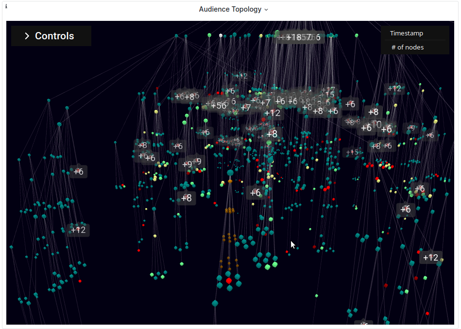
Groups rendering and expanding action reference -
Chart interactivity details: The chart is adapted to let you explore nodes information by rotating the tree diagram, hovering the nodes to display individual information of each one, seeing groups number indicator when you are approaching by zooming into them, letting you focus on the nodes expanded approaching the point view to them.
-
Other internal improvements: The chart balances the form to render properly the nodes avoiding their collision, keeping a good image quality and performance.
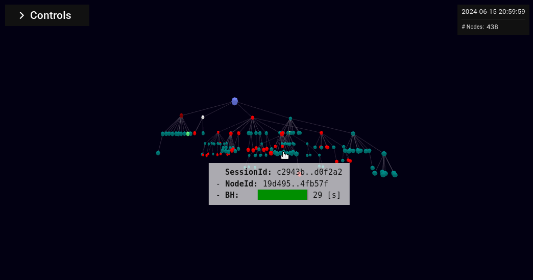
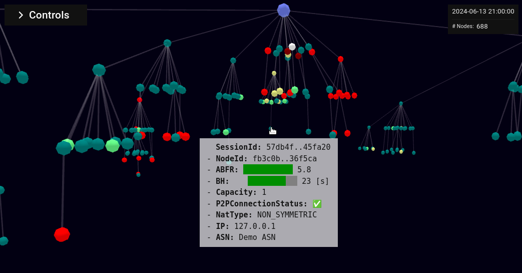
Tooltip
Depending on the user tier, different details of nodes are displayed on the chart tooltip:
- Session Id
- Node Id
- AFBR
- Buffer Health
- Capacity
- P2P Connection Status
- NatType
- IP
- ASN
Lite tier nodes information
Advanced tier nodes information
Filtering
We offer you the possibility to alter the data displayed on the dashboard by applying time intervals and/or one or more filters of your choice.
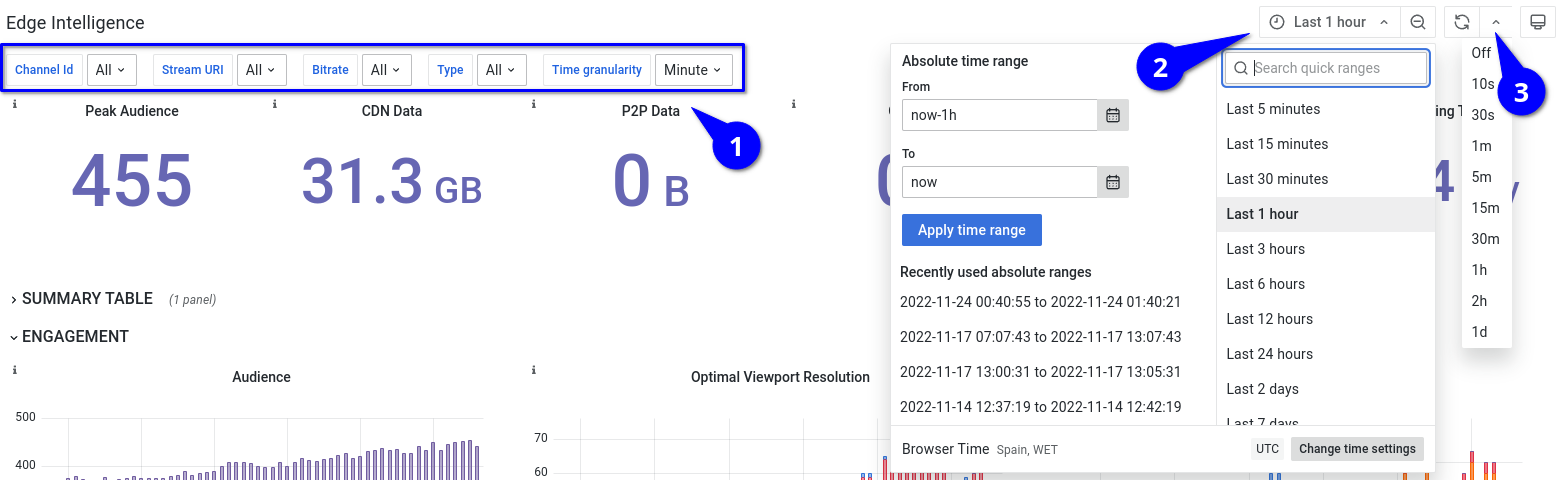
- You can filter by Channel Id, Stream URI, Bitrate and Type. For those, by default no filter is applied, while the Time granularity filter must and will always have a value.
- On the time interval picker you are free to choose from the quick relative time ranges or craft your own absolute time intervals.
- You can set your dashboard to auto refresh if you wish with this setting.
Accuracy
Important
This control is only available for users in the Advanced tier.
Along with the filters you can set the accuracy of the results for charts that are based on queries that perform a count distinct aggregation.

There are two modes of accuracy:
- Fast: results are not guaranteed to be exact but the chart queries run faster.
- Precise: results are guaranteed to be exact at the expense of queries running slower.
The performance impact is noticeable when browsing data for large time intervals (a month or more) and/or fine time granularities.
Charts that are affected by this setting:
- Peak Audience
- Audience
- Optimal Viewport Resolution
- Suboptimal Viewport Resolution
- Optimal Viewport Percent
- Connection Speed
- Browsers
- Operating Systems
- Players & Apps
- Connection Types
- Geo Map
- Geo Heatmap
Data granularity and time frame
The platform dashboards are built on top of the data layers presented in the Architecture section. The level of detail or resolution (granularity) you see in the dashboard charts depends on both the time frame you select and the available granularities of the underlying data layers. The system automatically chooses the appropriate data layer based on these two factors.

An Auto granularity mode is available as well, choosing automatically the finest granularity
according to the time frame selected. This mode removes the need for manual selection and ensures
that charts use the highest level of detail supported for the time frame.
Note
It is important to note that the time frame does not have to end at the current time; you can select any period within the available data range.
Realtime layer
The realtime data layer is used for data within the last 30 days, but its availability depends on the desired granularity:
-
Second: available for time frames up to 1 hour (shows data points every second).
-
Minute: available for time frames up to 12 hours (shows data points every minute).
If you select a time frame within the last 30 days but request a minute granularity for a period longer than 12 hours, the system will switch to the historical data layer (explained below).
Historical layers
The historical data layers are used for longer time periods (within the last 13 months and up to 1 hour ago) or when the realtime layer is not available for the requested granularity within the last 30 days.
-
Minute: available for time frames up to 48 hours (shows data points every minute).
-
Hour: available for time frames up to 30 days (shows data points every hour).
-
Day: available for time frames from 24 hours up to 13 months (shows data points every day).
-
Week / Month: available for time frames from 30 days up to 13 months (shows data points every week or month).
Note
Be aware that the dashboard time frame picker takes into account the DST changes so when you select the Last X days and within the last X days a DST change occurred the calculated time interval could be X-1 days and 23 hours to account for the +/- 1 hour shift.
To ignore DST changes you can also set the UTC timezone on the time picker.
This section was last updated 2026-07-08